(Aleheads.com) - The craft brewing proliferation over the past few decades has increased the number of beers on package store shelves exponentially. With greater variety comes a greater need to differentiate your product. You can certainly do that by making better beer than your competition. Or by pushing the envelope with extreme beers. Or by developing new, unique styles. But one of the easiest ways to truly set your product apart from others is through the tried and true method of good marketing. Slap a pretty label on your bottles and all eyes will be on your beer. Granted, you need a good brew to keep the masses returning to your suds, but a great label is still one of the best ways to get your product sold in the first place.
We’ve talked about some of the best breweries when it comes to label design…and some of the worst. But we haven’t spent much time singling out the best individual labels on the market. That ends here…with a massive list of 100 of the greatest labels in the American craft beer world. Before we launch into the good stuff, I’ve got a few caveats:
As per usual, this list ONLY includes American craft beers. No macros and no imports. That includes Canada, so you won’t see the beautiful labels from Unibroue or Dieu Du Ciel on this list. Only ONE label was allowed per brewery. This was to prevent ale factories like Left Hand, Three Floyds, and Odell from utterly dominating the list.
There are close to 1,800 breweries in the US right now and I clearly haven’t seen every label produced by every one. If your favorite brewery is conspicuously absent, don’t get too upset…I’m just one man. I DID ask the other Aleheads for some suggestions, but other than a few regional suggestions from Kid Carboy in the Midwest, Sudsy in the Northeast (he recommended the #1 offering), and Beerford in the Pacific Northwest, the other Aleheads mostly agreed with my picks. When you’re talking about the “best” beer labels, you’re making completely arbitrary, highly subjective decisions. This list really just represents my specific aesthetic tastes and absolutely NO ONE else will agree with it. I’m not even sure I agree with it. Beyond that, I tried to “rank” the Top 100 which was really just silly. Is #47 really better than #48? Probably not. It really doesn’t matter.
So don’t let the rankings or any glaring omissions irk you. Just bask in the brilliant glory of America’s “best” beer labels. Enjoy!
************************************************
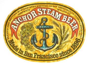
100.
Anchor Steam Beer: Dated? Perhaps. But you've gotta love the oldest
craft beer label in America. You can’t make a list like this without
including the grandaddy of them all.
************************************************
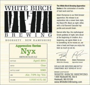
99.
White Birch Nyx: If you’re a tiny craft beer outfit that can’t afford a
graphic designer or fancy labels, this is the way to go. Simple,
faux-Birch background. Tasteful, striking logo. And a little cheat-sheet
with the brew’s vital stats. Sometimes utilitarian can work.
************************************************
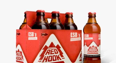
98.
RedHook ESB: Can’t say I’m a fan of the brew, but RedHook’s marketing
team has done a bang-up job with bottle and label design of late. I
suppose that’s one of the advantages of selling out to AB InBev.
************************************************
************************************************
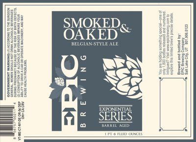
96.
Epic Smoked & Oaked: All of the Exponential Series of brews have
the same clean, distinct labels. I chose this one for the killer name.
************************************************
95.
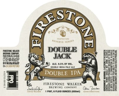
Firestone Double Jack: Firestone Walker’s classy labels aren’t the most
vibrant, but they all feature a goddamn lion boxing a goddamn bear. How
am I NOT going to include that on this list? My money’s on the bear who
seems to be in more of a street-fightin’ stance in contrast with the
lion’s gentlemanly “put-up-your-dukes” posture.
************************************************
94.
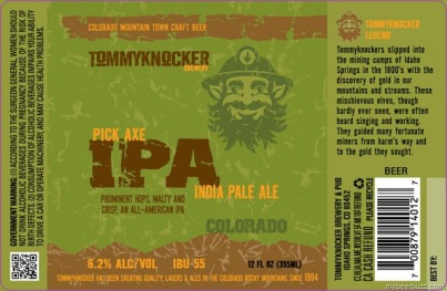
Tommyknocker Pick Axe: Full disclosure...I absolutely HATED the old
Tommyknocker labels. They sucked horseballs. But I’m thoroughly enjoying
the new label designs and I think the Pick Axe employs the best color
scheme.
************************************************
93.
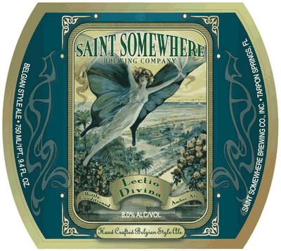
Saint Somewhere Lectio Divina: I know the giant human butterfly should
be freaking me out, but this label just makes me feel so peaceful.
************************************************
************************************************
91.
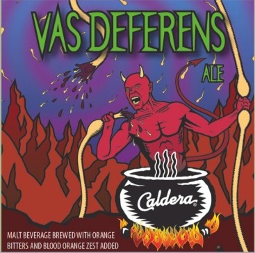
Caldera Vas Deferens: This one actually makes me cringe, but Beerford
loves it, so what the hell. Plus, it’s very informative. I had NO idea
that vasectomies were performed by miniaturizing a demon with a
Fantastic Voyage shrink-ray, inserting him into your testicles, and
having him tear your sperm tubes apart with his teeth.
************************************************
90.
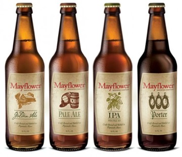
Mayflower IPA: All of the Mayflower labels are lovely, but the IPA has a
hop-leaf on it, so it wins. Get used to pictures of hops, by the
way...you’ll be seeing lots of them.
************************************************
89.
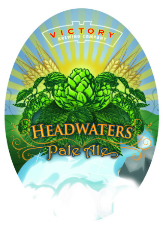
Victory Headwaters: Hey look! Hops! This perfectly illustrated label
marries barley, hops, water, and sunshine into one of the most alluring
images of the building blocks of beer that you can find on a label.
************************************************
88.
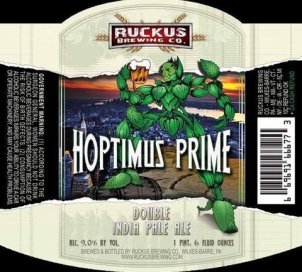
Ruckus Hoptimus Prime: The name is better than the label, but still, if
you name a beer after a Transformer, you’re on the list. Speaking of
which...where's my Starscream Stout?
************************************************
87.
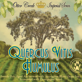
Otter Creek Quercus Vitus Humulus: If you look under that tree, you’ll
find a rock that has no earthly business in a hayfield. There’s
something buried under it I want you to have.
************************************************
86.
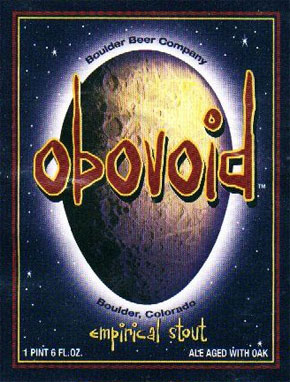
Boulder Obovoid: I like beer names that send you running to a
dictionary (OK, fine...the dictionary app on your phone...kids today).
************************************************
************************************************
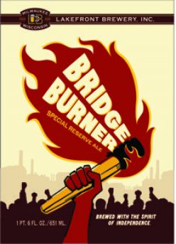
84. Lakefront Bridge Burner: A Kid Carboy recommendation, the Bridge Burner is eye-catching and vaguely anarchistic.
************************************************
83.
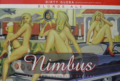
Nimbus Dirty Guera: I tried to limit the cheesecake entries in this
list (see our earlier sexiest beer labels post for those), but I
couldn’t leave this one out. Beyond the trifecta of nearly-nude,
pneumatic beauties, the absurdist monkey face in the mirror makes this
one a winner.
************************************************
82.
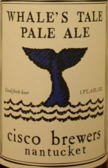
Cisco Whale’s Tail: As you’ll see, I’m easily swayed by old-timey beer
labels and this one looks like a brew you would have found on the
writing desk of John Adams as he jotted off another screed denouncing
that pissant Hamilton.
************************************************
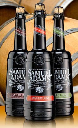
81.
Sam Adams Stony Brook Red: All of the Barrel Room Series brews look the
same, but I like the Stony Brook colors the best. The “etched” graphics
are elegant and the bottles themselves are knockouts.
************************************************
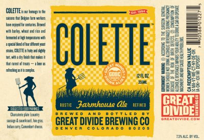
80.
Great Divide Colette: Great Divide’s consistent, striking labels are
some of the best in the biz. Choosing one is impossible, but the Colette
always jumps out first to me when I’m perusing package store shelves,
so it gets the nod.
************************************************
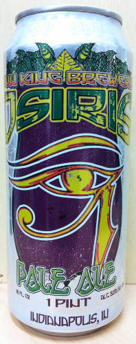
79.
Sun King Osiris: The craft canning revolution has allowed for some
gorgeous label art and Sun King has some beauties. I love the bold
colors and sharp graphics of the award-winning Osiris.
************************************************
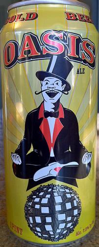
78.
Tallgrass Oasis: One of the go-to craft cans in the McHops Monastery,
the Oasis straddles that fine line between craft beer and energy drink.
Love the little spherical city on the bottom.
************************************************
77.
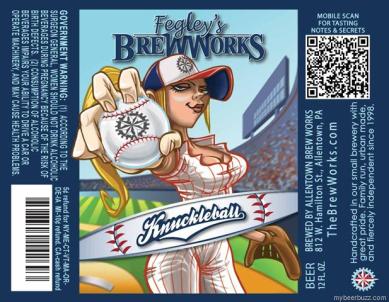
Fegley’s BrewWorks Knuckleball: Fegley’s has a number of cool labels,
but I picked this one for the highly accurate depiction of how to throw a
knuckler (with your fingernails...NOT your knuckles). Oh, also,
cleavage.
************************************************
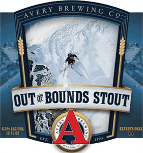
76. Avery Out of Bounds: Avery’s new labels are awesome and the Out of Bounds is the best of the lot. Great beer too.
************************************************
75.
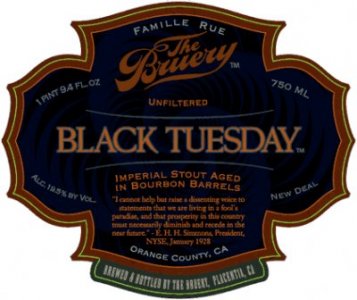
Bruery Black Tuesday: All of the Bruery’s offerings are branded like
fine port or cognac. I love the elegant, thoughtful crests on each
bottle, but the Black Tuesday’s is the most dramatic in terms of color
scheme and that little “19.5% by Vol.” text in the bottom left corner.
Yikes.
************************************************
74.
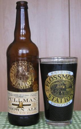
Flossmoor Station Pullman Brown: Like I said, I’m a sucker for
old-timey labels. This one looks like a brew ol’ Dr. H. H. Holmes would
have pounded before murdering another victim in his basement vault.
************************************************
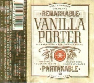
73.
Breckenridge Vanilla Porter: Yet another throwback label. Love the
watermark and the rarely-used superlative, “Partakable”. I also like the
“Original Mountain Recipe” text. I didn’t realize vanilla beans grew in
the Rockies...
************************************************
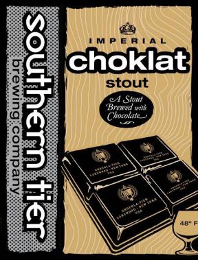
72.
Southern Tier Choklat: Southern Tier’s consistently attractive labels
are all excellent, but the Choklat combines old-school class with
new-school style better than the rest. It’s so good-looking that you
won’t mind getting diabetes from the beer.
************************************************
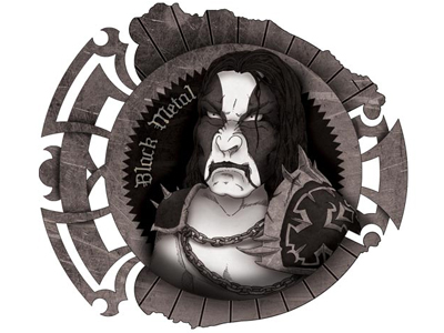
71.
Jester King Black Metal: Herr Hordeum loves this one. Craft brewers
seem to have a “thing” for heavy metal and the folks at Jester King
showcase that preference beautifully with this sweet label.
************************************************
************************************************
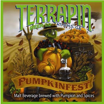
69.
Terrapin Pumpkinfest: I’m a fan of the whole autumnal tableau, but it’s
the tap directly on the pumpkin that cinches it for me. I’ve often
wished I could just jam a tap into various objects and that beer would
come out. Sigh...a boy can dream.
************************************************
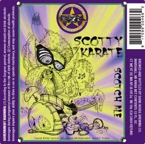
68. Dark Horse Scotty Karate: I have absolutely no idea what’s going on here. But it’s kind of awesome.
************************************************
67.
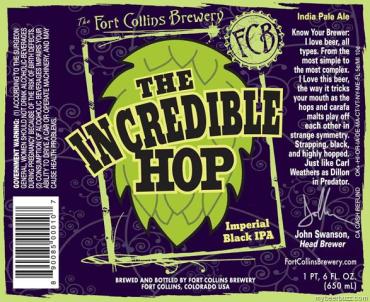
Fort Collins Incredible Hop Imperial Black IPA: One of those labels
that seems unimpressive on the surface. But the iconography, color
scheme, font choice, and background filigree all work in perfect,
eye-catching harmony.
************************************************
66.
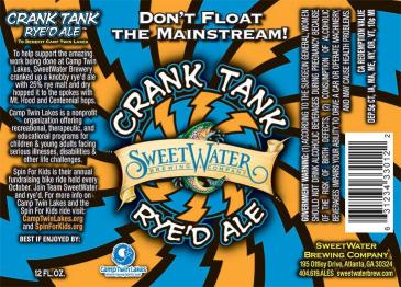
Sweetwater Crank Tank Rye’d Ale: Speaking of eye-catching, this one
will sear your retinas if you look at it for too long. But I guarantee
you’re not walking past it on the package store shelf.
************************************************

65.
Harmon Imperial Red Ale: This used to be the Harmon Killer Brew, but
they were forced to change the name and packaging by the Harmon
Killebrew Foundation (totally understandable). Harmon didn’t make a fuss
and I think we can all agree that the new label is inspired. The Czar,
in particular, should love this one (Svetlana was the model).
************************************************
64.
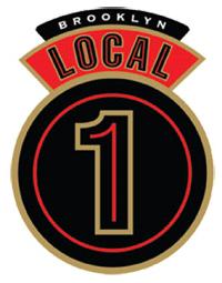
Brooklyn Local 1: Brooklyn’s labels are normally nothing special, but
their Local series uses bold lines and minimal graphics for a big
impact.
************************************************
63.
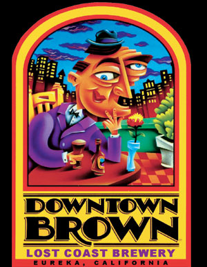
Lost Coast Downtown Brown: Lost Coast’s cubist art might seem a little
“funky for funky’s sake”, but I dig ‘em. The Downtown Brown’s kind of
creepy city scene is my favorite.
************************************************
************************************************
************************************************
60.
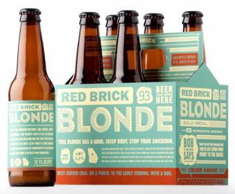
Red Brick Blonde: I actually like “busy” labels as long as the beer
name clearly stands out...as it does with all of Red Brick’s offerings. I
can state from experience that these six-packs really jump out at you
on the shelves.
************************************************
59.
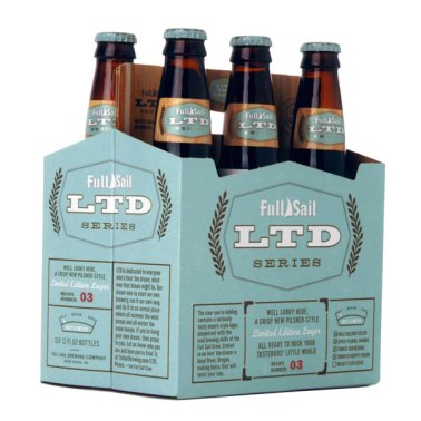
Full Sail LTD: The LTD Series is another great example of “busy” done
well. Lots of text, but the name of the beer dominates and the font
choices and color scheme are dead-on.
************************************************
58.
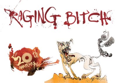
Flying Dog Raging Bitch: Ralph Steadman is one of the few legitimately
famous artists who happens to design beer labels on the side. It’s
impossible to pick out just one of his gonzo illustrations, but the
Raging Bitch is particularly striking...mostly because of all the
nipples.
************************************************
57.
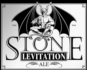
Stone Levitation: I’ll admit to being left a little cold by Stone’s
etched-on gargoyle graphics (they sometimes have too few points of
differentiation between beers). But I love the Levitation with its
hovering, menacing demon and dramatic, all-caps fonts.
************************************************
56.
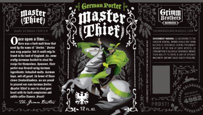
Grimm Brothers Master Thief: The Grimm Brothers cleverly market their
beers as miniature fairy tales. I'm a fan of the green highlights and
subtle, but pervasive filigree throughout the label. Great, old-style
fonts too.
************************************************
55.
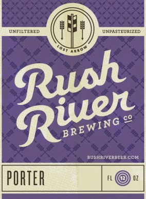
Rush River Lost Arrow: Rush River, like Great Divide, uses highly
consistent labels that employ unique iconography and color schemes to
differentiate between their offerings. It’s one of my favorite
approaches to label design...make sure the user recognizes your brand,
but can clearly tell the difference between your beers. There’s a fine
line between being consistent and being “too” similar and Rush River
manages it perfectly.
************************************************
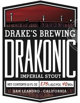
54. Drake’s Drakonic: Not much to this one, but the compact, highly dramatic font choice makes this Drake’s finest.
************************************************

53.
Schlafly Raspberry Coffee Stout: At this point, you probably recognize
my tastes. Big, blocky fonts. Simple, clean, clear graphics.
Contrasting, but complementary color choices. This one’s got it all.
************************************************
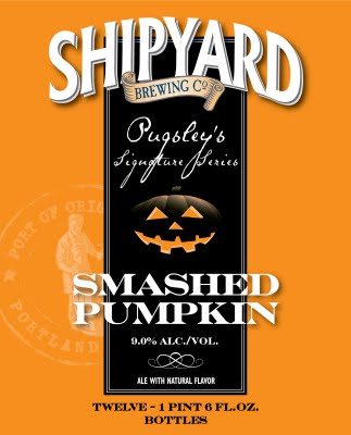
52.
Shipyard Smashed Pumpkin: I detest the “everyday” Shipyard labels, but
the Signature Series has some works of art. Their best-in-class pumpkin
ale, the Smashed Pumpkin, is probably their finest.
************************************************
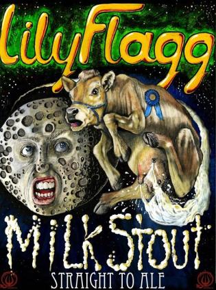
51.
Straight to Ale Lily Flagg: Bit of a cheat since Straight to Ale
doesn’t bottle their offerings yet, but the Lily Flagg has some of the
creepiest art out there with a clearly disconcerted cow jumping over a
flat-out freaky-faced moon. Very well conceived.
************************************************
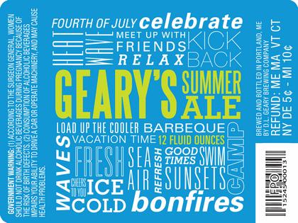
50.
Geary’s Summer Ale: Geary’s let some design students take a crack at
their Summer Ale and the winner was this striking, font-tastic label
listing all the great things about the hottest time of year.
************************************************
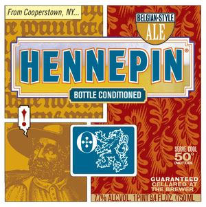
49. Ommegang Hennepin: This strange, but compelling label looks like a page from a 17th century, Belgian comic book.
************************************************
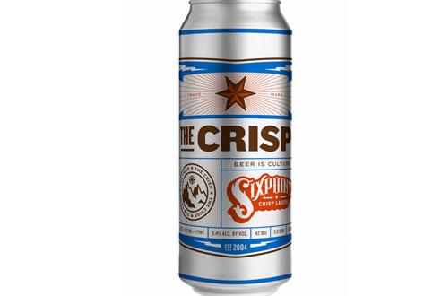
48.
Sixpoint The Crisp: There’s really no point in trying to pick just one
of Sixpoint’s charmingly designed cans, but The Crisp is as good a
selection as any.
************************************************

47.
Good People Snake Handler: All of Good People’s cans straddle the fence
between modern design sensibilities and old-time charm. They all
feature some “worn out” edging on their graphics like a pair of
pre-stressed jeans. Pretty cool.
************************************************

46. AleSmith IPA: My only problem with this label is that it’s difficult to figure out what style of beer it is.
************************************************
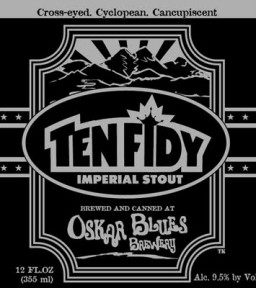
45.
Oskar Blues Ten Fidy: Like Sixpoint, all of the Oskar Blues cans are
great, but the simple starkness of the silver and black Ten Fidy gets my
vote. If Raiders fans didn’t mostly drink gasoline, this would be their
beverage of choice.
************************************************
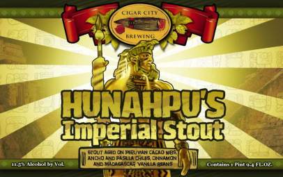
44.
Cigar City Hunahpu: I’m probably being swayed by my love of this
massively tasty beer, but the Mesoamerican motif and brilliant colors
are thoroughly impressive.
************************************************
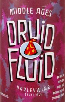
43.
Middle Ages Druid Fluid: Most of the Middle Ages labels are, shall we
say, a bit amateurish. But I like everything about the Druid
Fluid...from the name, to the colors, to the font, to the little wizard
cap.
************************************************
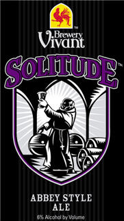
42.
Brewery Vivant Solitude: Word on the street is that this newish,
Belgian-style craft brewery in Michigan makes beers that are every bit
as distinguished as their phenomenal canned label art.
************************************************
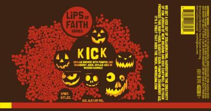
41.
New Belgium Kick: A few of the Aleheads agreed that this was New
Belgium’s best label yet. I can’t argue. It’s a work of art...one of
those bottles you buy just for the looks alone.
************************************************
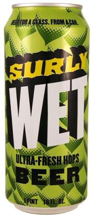
40. Surly Wet: I mean...the entire can looks like a hop flower. What else can I say? Perhaps this should have been number one.
************************************************

39. Troeg's Perpetual: Hop bines feeding into some complex gearwork and pouring out of a tap? That’s cheating, Troeg’s!
************************************************
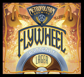
38.
Metropolitan Flywheel: Clearly I’m partial to machinery-laden beer
labels. All of Metropolitan’s labels have an industrial vibe and the art
deco Flywheel artwork is their best.
************************************************
37.
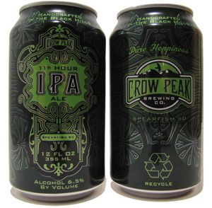
Crow Peak 11th Hour: Just a beautiful can. I’ve never had Crow Peak’s
offerings, but if I lived in their distribution area, I’d have sixers of
the 11th Hour in my fridge all the time just so I could look at them.
************************************************
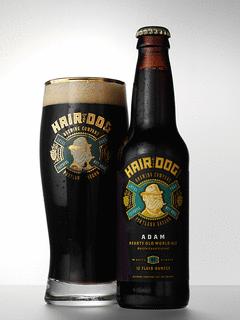
36. Hair of the Dog Adam: I’ve always loved Hair of the Dog’s perfectly composed logo. This is what craft beer should look like.
************************************************
35.
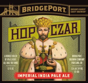
Bridgeport Hop Czar: If I designed playing cards, this would be my King
of Hops. Also, the suits would be Hops, Barley, Casks, and Yeast (you
don’t want to know what the Queen of Yeast looks like).
************************************************
34.
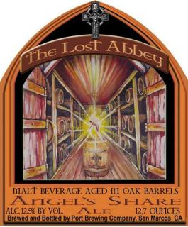
Lost Abbey Angel's Share: I know the term Angel’s Share refers to the
liquor that evaporates out of a cask of spirits, but I prefer to believe
that a little angel hovers above bourbon barrels getting absolutely
‘faced.
************************************************
33.
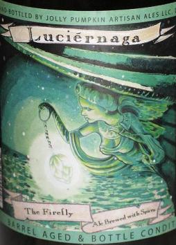
Jolly Pumpkin Luciernaga: The spooky, maritime-themed Jolly Pumpkin
labels are each a work-of-art unto themselves. For my money, you can’t
beat the Luciernaga. Extra points for her hop-shaped lantern.
************************************************
32.
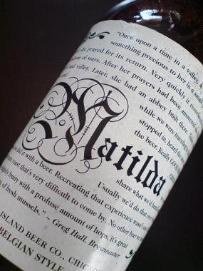
Goose Island Matilda: The newer Matilda label is much simpler and
cleaner, but I actually preferred this older, text-heavy, “story”
version. It will be disappointing when AB InBev introduces the Key
West-themed “Matilda with Lime” next year.
************************************************
31.
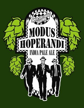
Ska Modus Hoperandi: Love the drab green, simple graphics, and
Reservoir Dogs triumvirate walking towards you. Also, love the beer.
************************************************
30.
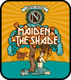
Ninkasi Maiden the Shade: Our second usage of the Iron Maiden font. I
don’t really know why that little fairy is jabbing the tree with a
spear, but I’m mesmerized nonetheless.
************************************************
29.
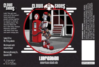
Clown Shoes Lubrication: The label that started some serious
BeerAdvocate controversy. I have no idea why. I love this label and
think Stacey George’s artwork is top-notch.
************************************************
28.
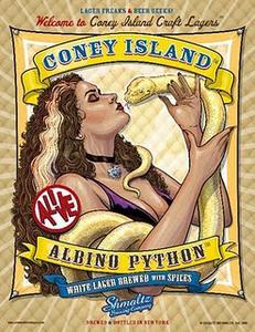
He’brew Albino Python: I originally had the Lenny’s Bittersweet RIPA in
this space before reader Jaydles reminded me of the Albino Python. Yes,
it’s a cheesecake shot and a little creepy. But it will make you wish
you were a snake, which is something. Also, cleavage.
************************************************

27.
Laughing Dog Dogzilla: First of all, some of the skyscrapers are beer
bottles. Second, there’s a giant dog terrorizing the city. As a fervent
dog-lover and overly affectionate dog-owner, I’d like to think I would
be spared from Dogzilla’s wrath.
************************************************
26.
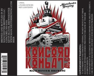
Manchester Konkord Kombat: The pseudo-Cyrillic font is great by itself,
but I find the concept of a tank rolling into the capitol building in
Concord, NH to be utterly, bafflingly perfect.
************************************************
25.
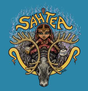
Dogfish Head Sah'tea: I’m no fan of Dogfish Head’s scattershot label
art, but the Sah’tea’s India meets Finland cartoon concept is just too
good. Gorgeous color scheme too.
************************************************

24.
Bell’s Oracle: Not as famous as its delicious brother the HopSlam, but
the Oracle is definitely the better looking bottle of beer. The
hand-tooled, gold-leaf inlaid “leather” is the perfect approach for a
dignified DIPA.
************************************************
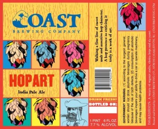
23.
Coast HopArt: I’m not sure what I like more. The wood grain. The
Warholian, multi-colored hops. Or the “Can You Draw This Yourself?”
pirate in the last panel. Whatever. It’s awesome.
************************************************
22.
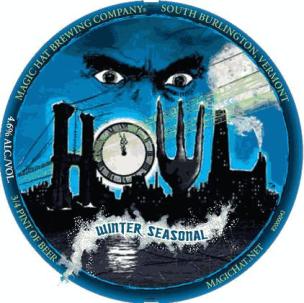
Magic Hat Howl: Magic Hat’s beers have been slipping in quality of
late, but their label art is just as trippy as always. The
werewolf-themed, vaguely Victorian Howl is a masterwork.
************************************************
21.
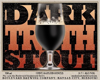
Boulevard Dark Truth: I can’t walk by this label without buying a
four-pack. If there were awards for beer labels, the designer of this
one would clearly win the coveted “Best Use of the Beer’s Name As the
Entire Label” award.
************************************************
20.
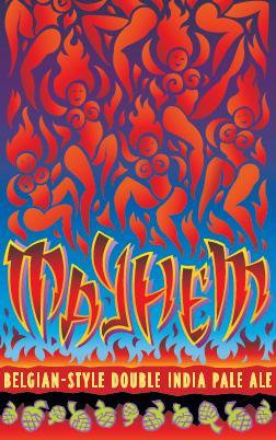
Midnight Sun Mayhem: This one would be cool enough even if the flames
in the sky WEREN’T naked dancing women. But they are. Hence, Top Twenty.
************************************************
19.
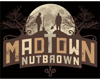
Ale Asylum Madtown Nutbrown: In the words of Kid Carboy, “I’ll bet this
is the only label on your list to feature a midnight burial.” Indeed it
is, Kid.
************************************************
18.
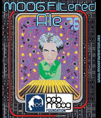
Asheville Brewing Moog Filtered Ale: Easily the ugliest label on the
list, the Moog Filtered Ale is named in honor of Asheville native and
electronic music pioneer, Bob Moog. If craft beer had actually existed
in the 80s, this label would have been king.
************************************************
17.
Pretty Things Confounded Mr. Sisyphus: The Baron is our resident Pretty
Things champion and this was his pick for their best label. Hard to
argue with that weird, flute-playing cherry. He looks like an
inscrutable forest spirit from some classic Japanese anime flick.
************************************************
16.
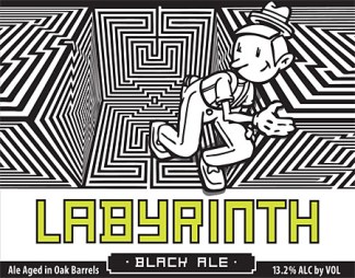
Uinta Labyrinth Black Ale: Yeah, I don’t know. Pinocchio maybe? Running
around some eye-boggling maze cubes? Whatever. I love it.
************************************************
15.
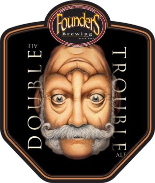
Founders Double Trouble: No matter how drunk you get off this
high-octane DIPA, you will still clearly see a face in this label.
************************************************
14. Sierra Hoptimum: I would hang this over my mantle. I’m serious.
************************************************
13.
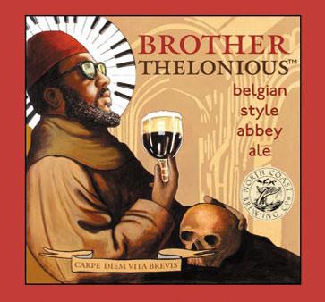
North Coast Brother Thelonious: No one has ever looked cooler than
Thelonious Monk on this label. And the piano-halo is just the icing on
the cake.
************************************************
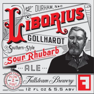
12. Fullsteam Liborious: By now you know my feelings on old-timey beer labels. This is the best of the lot.
************************************************
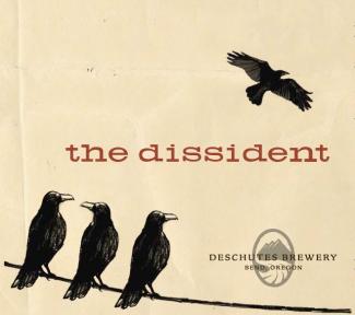
11. Deschutes The Dissident: Escape is never the safest place...
************************************************
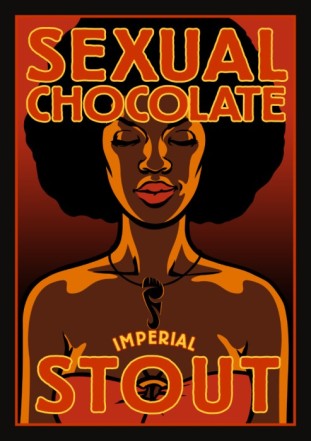
10. Foothills Sexual Chocolate: Sexist? Sure. Exploitative? Maybe a little. Dazzling? Absolutely.
************************************************
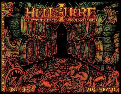
9. Oakshire Hellshire: The perfect combination of Ed Roth and Albrecht Durer. This is what Cthulhu’s wine cellar looks like.
************************************************
8.
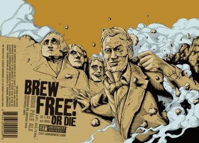
21st Amendment Brew Free or Die: Of all the awesomeness inherent in this label, I think the various presidential facial expressions are the
key. There’s Lincoln’s smirk, Washington’s anxious frown, Jefferson’s
concerned grimace...and Teddy R’s unmitigated joy.
************************************************
7.
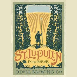
Odell St. Lupulin: I had no idea how to pick from the sheer perfection
that is Odell’s label line-up. Everything they do is spot-on. I chose
the St. Lupulin because it has hops parting in such a way as to create a
beer glass out of sky and barley fields. And the name...and the
colors...and the...you know what? Just look at it.
************************************************
6.
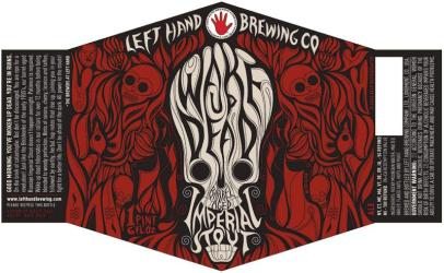
Left Hand Wake Up Dead: Left Hand was my pick for best brewery in terms of overall label art. The Wake Up Dead gives me no reason to change my
mind.
************************************************
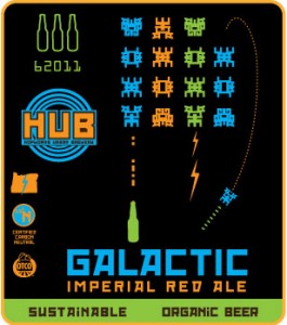
5. HopWorks Galactic: It’s Space Invaders with beer bottles. Do I need to elaborate?
************************************************
************************************************
3.
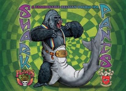
Three Floyds Shark Pants: How can you possibly pick just one of the
dozens of amazing Three Floyds labels? Simple...just look for the one
depicting a gorilla wearing a shark as pants held up by rainbow
suspenders and a #1 Dad belt. My only quibble is that the gorilla really
shouldn’t need suspenders AND a belt. But then again, I’ve never worn a
shark before.
************************************************
2.
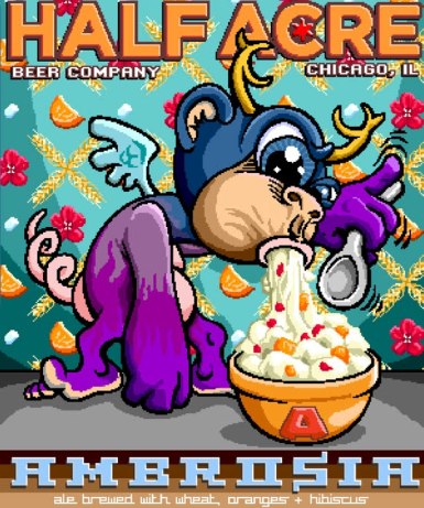
Half Acre Ambrosia: Why more breweries use labels with pixelated,
purple, monkey/deer/bat chimera hoovering up a bowl of whipped cream
and fruit is beyond me. Is it really that hard?
************************************************
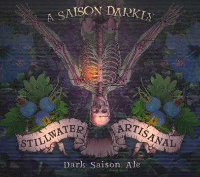
1. Stillwater A Saison Darkly: Winner, winner...chicken dinner.
************************************************
Thank you beer label artists for providing us with such aesthetic
inspiration. And now, my fellow Aleheads, let us know which labels we
missed. We did the best we could, but there’s just so much good artwork
out there. Surely some masterpieces fell through the cracks!


No comments:
Post a Comment